Grapes
eight frames or whatever. practically. functionally.
lets talk more about this week some other week
eight frames or whatever. practically. functionally.
lets talk more about this week some other week
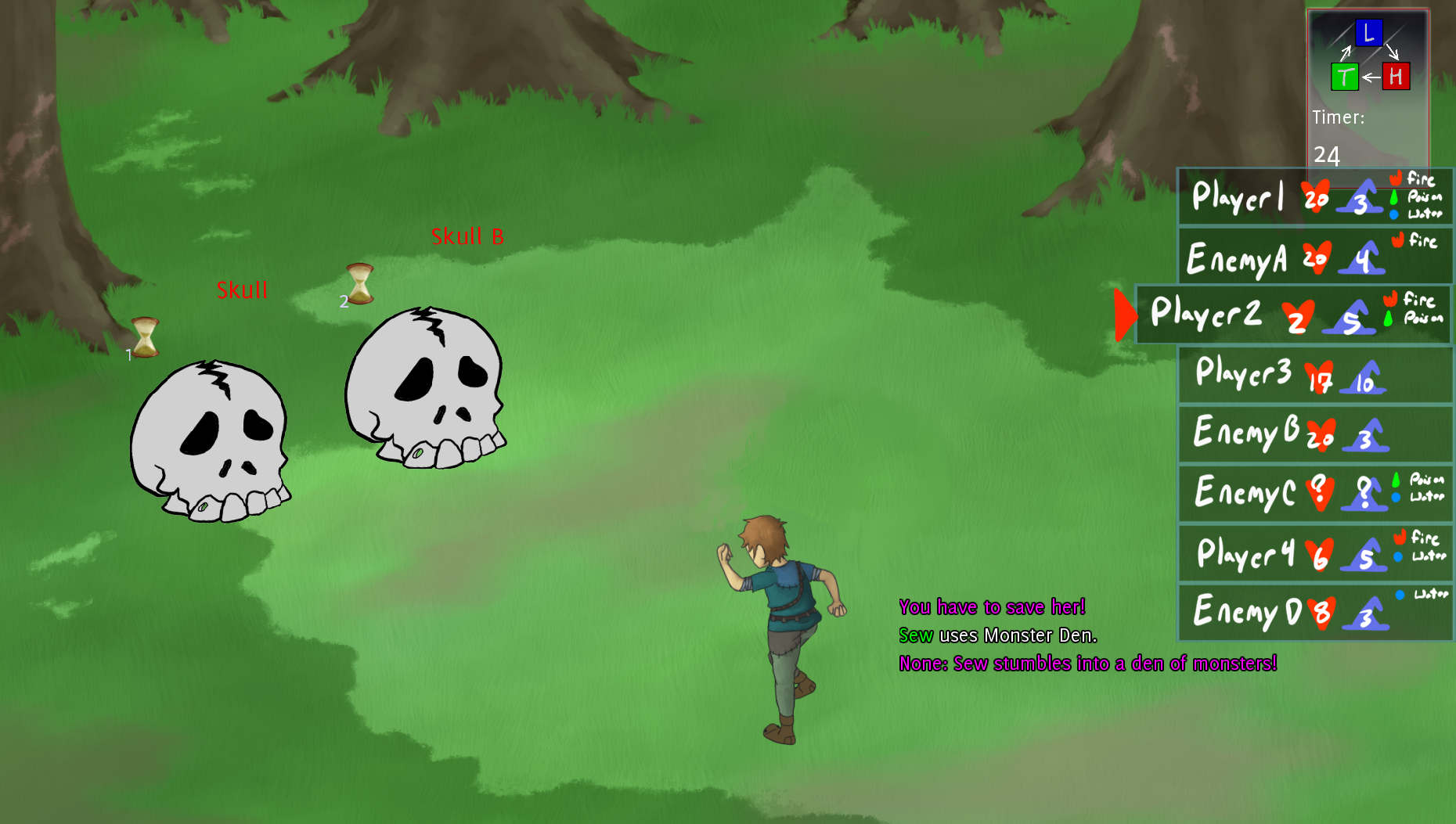
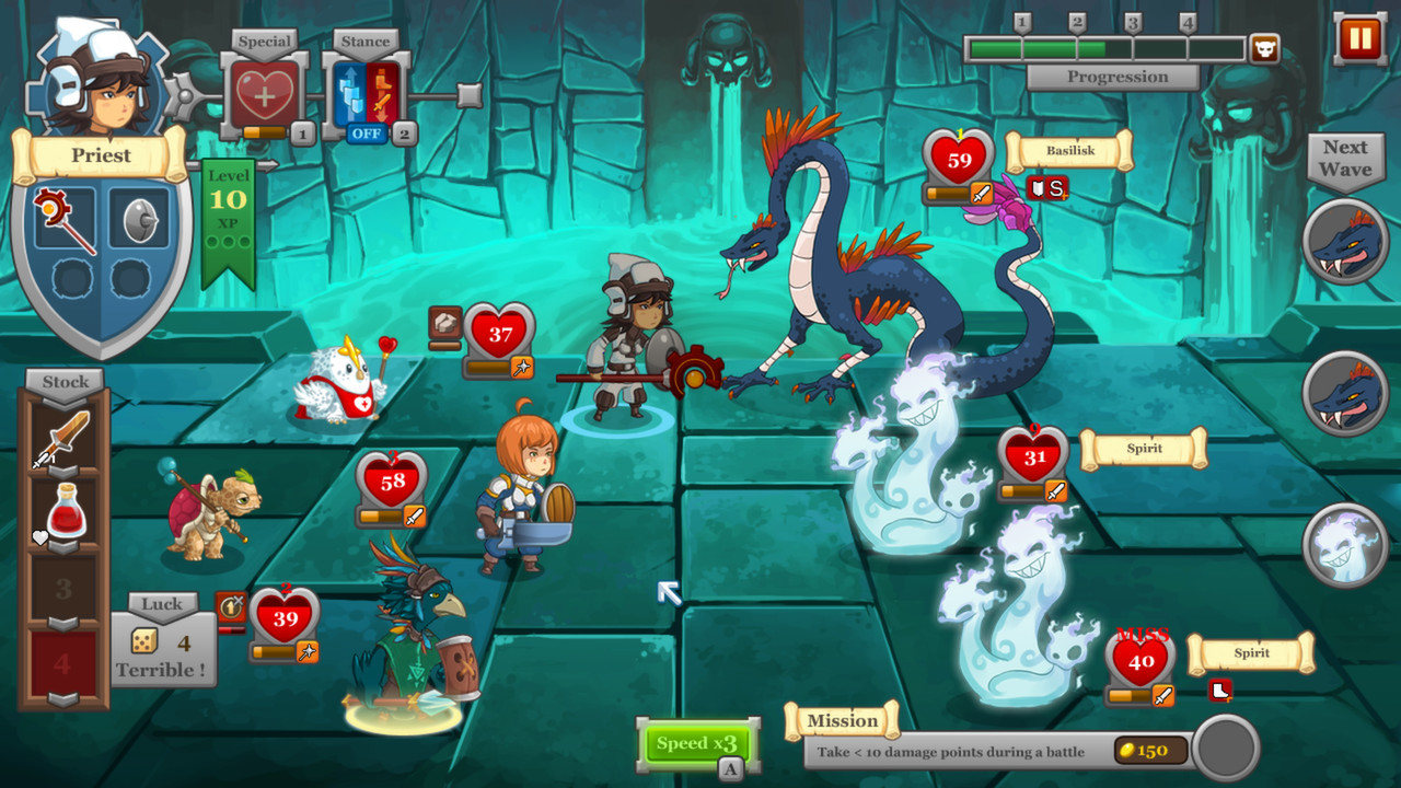
As Hawk mentions over in blog purgatory, I’ve spent the majority of the week revamping and mulling over what to do about the battle GUI. Let’s just talk about it a bit for a second.

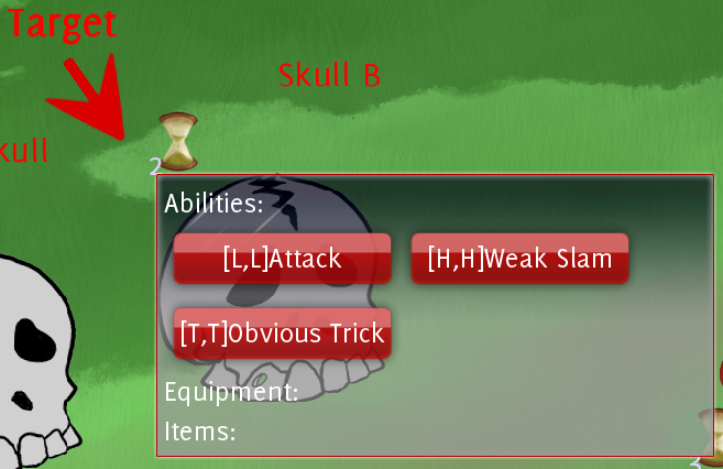
I’ve added stars in front of the monster names to indicate how many types of attacks they are using. Realistically, this will change soon to be more specific. Instead of 3-stars, it will be “Rock Paper and Scissors”, or just “Rock & Paper” etc. This is one of those things that we debated a bit, but for approachability reasons it’s probably best to just lay it out on the table from the get-go.
In the attack dialogue we have a few too many colors going on here. I’m all for lovely colors spewing from an interface, but the RBG on the attack names might have taken us a step over. I’m hoping that when I add proper icons to the attack names they won’t won’t read as too busy either, or I might be forced into cutting the “Abilities, Items, & Equipment” icons from the start of the list.
Of course the real attraction here is the turn-order list. Players names, a quick stat bar for their HP/MP, and then a list of all their status effects below them. Status effects in a square are actually permanent passive effects caused by class/item/ability/whatever, and effects in circles are actual status effects that will only last so long, like fire or poison. This seems nice at the moment, but when I draw the actual icons for these things it might be harder to keep them in a circle or a box and still be somewhat readable. This is my only current real concern with this layout. I may have to increase the size of each player box by a tiny amount.
To the left of the turn-order boxes are the sword icons that say “This player (color) is attacking this monster!”, and a tool-tip will tell you what they are attacking with. Alternately, a colored potion icon would appear beside a player who is healing someone. To the right of the box is an idea I think we already scrapped, a “has finished their turn” green check mark. This is likely scrapped for just snapping finished players boxes flush to the right side of the screen.
The timer has been moved to the bottom of the turn-order list, which I’m not wild about but am apparently alone in that, so I won’t argue much. Below that I added an ESCAPE icon which might need more attention called to itself, but we’ll see. Easy edits.
I need to mull over this for a few more days while I work on some more animation stuff, and then once I’m more confident in it I’ll create the proper asset set and send it to what’s his name.
Just more of this.. hm hm
This two from last night scrapped for the following idea?
Was working on battle dialogue but.. simplifying it require that discussion about Light Heavy and Trick to happen for a final time. <3
A few things. I’m almost back in a full 100% of the time swing of game-workin’. Today was my last day of ‘dealing with other things’ for awhile. Sorry for being so inactive and having nothing super exciting to show for a bit!
Having said that, it might have been for the best. The game is starting to come together a lot better now, and I have a much stronger sense of what it is and what it needs to be. I’ve seen things in action and motion and I’m getting a much stronger feel for what is working visually and what isn’t.
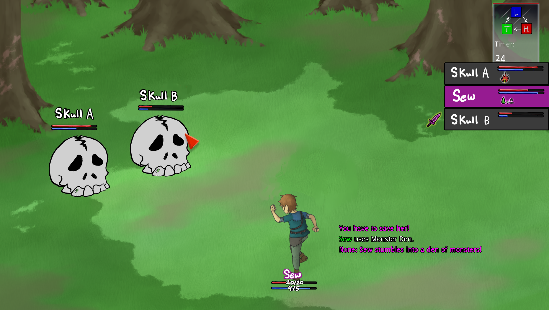
So the most recent thing we talked about visually was the battle gui. Currently it looks like this, with the player GUI and the monster targeting/attack dialogue respectively.

So this is.. kind of okay. The idea was to have the each player’s individual gui displayed on top of them (or at least near them). This is fine in theory, but it feels like work in a full fight of 4 players v 4 monsters. Your eyes are constantly darting. It is not my intention to pick on anyone else, but Hawk linked to an image of this kind of thing going overboard, and how it is kind of a slipper slope if we start adding on a bunch of status effects and timers and what not. Should this be a real concern of ours? I’m leaning towards yes, as instant readability is what I want most across this entire project. So how do we fix this?
We could approach it in a similar fashion to how we do our map GUI, which is to display players information along the bottom and top of the screen. We’d want it more compact because we don’t need to display as much information. There are a few differences. For one, on the map your character sheet is always on the leftmost side. You wouldn’t want this to be the case in a fight, you’d want it to be displayed in the order in which the heroes are lined up. (You could keep your own card always leftmost still, but you’d want to rearranged the heroes in fight to correlate to that and it just seems like a weird hassle, especially when trying to talk to another player about a fight, though I may be over-thinking this).
I left a big gap on the bottom that doesn’t really need to be there. My thought was to put attacks and abilities there but there are too many and we’d just run out of room. Ideally I could just compress this shape down further into something more manageable. However, I’m wondering if it is necessary to re-do the enemy GUI. It’s possible that leaving the hearts and timer above them isn’t an issue, though.. I could again be mistaken. This requires more mock-ups and discussion!
I’d also like to talk about the map GUI since we’re here..
I have issues with the current map character sheets as well, but it’s entirely a readability issue. (My kingdom for a way to skew and adjust things in real time). I think a lot of it might be the lack of a stroke around the text, and a few things displaying too small at a full resolution. There is no attention drawn to it in a positive way. It needs to not be loud and over-stress the screen, but it does need to quickly call attention to the important information, which it isn’t properly doing right now..
I’m kind of all over the place lately. Sorry about that.
I think I can get away with any level of paintery-ness I’m comfortable with if I just use my dark outlines properly. I’m not sure about the map mock up, but I’m thinking it probably is best to cut down on the painted style for the characater animations. Makes the mesh tweaking look better. The cel-shaded is also nice contrast on a slightly more painted background/map.
I guess the answer I came up with is basically cartoony with wiggle room style wise to get as close to serious as we want or need to at the drop of a hat with no.. real set backs. We can pretty much be whatever. always.