April 2016
After spending two months struggling with the UI, I was at an impasse. At the same time, a game called Stardew Valley had recently come out. While being heavily based on the console game Harvest Moon, it still used a hotbar UI common in PC games for its interface rather than strictly adhering to its inspiration. It took awhile before it really sunk in, but I finally realized I was getting way ahead of myself. Our initial release was always going to be on the PC. It was idiotic to try to build a console-style experience first and foremost (even if shared screen multiplayer had become a minor phenomenon on PC). And while I always wanted to make this game feel like a console-styled RPG, you can capture that feel without crippling your interface for your primary audience.

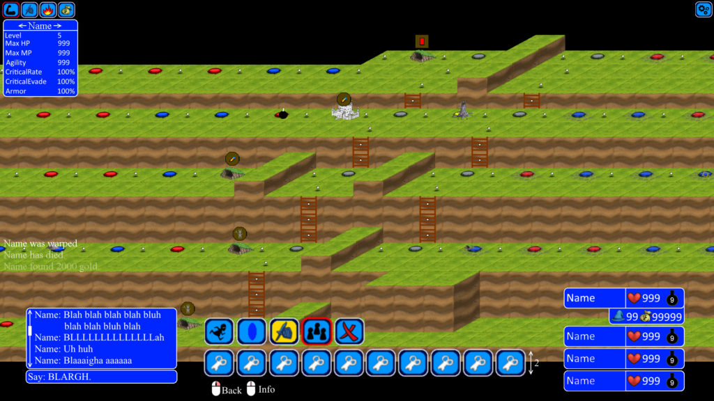
The new interface completely gave up on the concept of simultaneous hotseat multiplayer and focused squarely on the online experience (though turn based hotseat remained as an option). The most obvious change is using an MMO-style hotbar for common actions (moving, attacking, ending turn, etc) and abilities. This was to address the common issue of testers getting a new ability and completing forgetting it as an option- it’s much easier to remember when it’s always in your face. The other major introduction was an “offline info” tab panel that let players look at stats, equipment, shops, and other information even when it isn’t their turn (addressing another major tester complaint that they couldn’t access anything when it wasn’t their turn). The implementation for the new system proceeded immediately and took up the rest of the month and then some.
May-July 2016
These months were a mixture of doing long outstanding improvements to the UI (properly splitting up long chat text), continuing engine improvements (using a proper sprite atlas generator instead of cobbling them together by hand, supporting flipping specific frames), continuing the new UI (updating targeting systems for clicking on targets instead of the gamepad-focused list of targets, improving hotbars), building the new battle turn order display, etc. In short: lots of bland, but necessary work.![]()
One of the few novel changes at this time was displaying possible attack types directly on the characters (with larger icons when they have more of that type), and then transforming them into weapons/shields that react to each other to inform players of how the system worked. While visually bloated, this seemed to fix most tester confusion.