Unfortunately, I’ve put this off for so long that it’s going to start being difficult to accurately remember the process at this point, even with a reasonable amount of internal documentation. I don’t want to completely give up on documenting this thing, though, so better late than never.
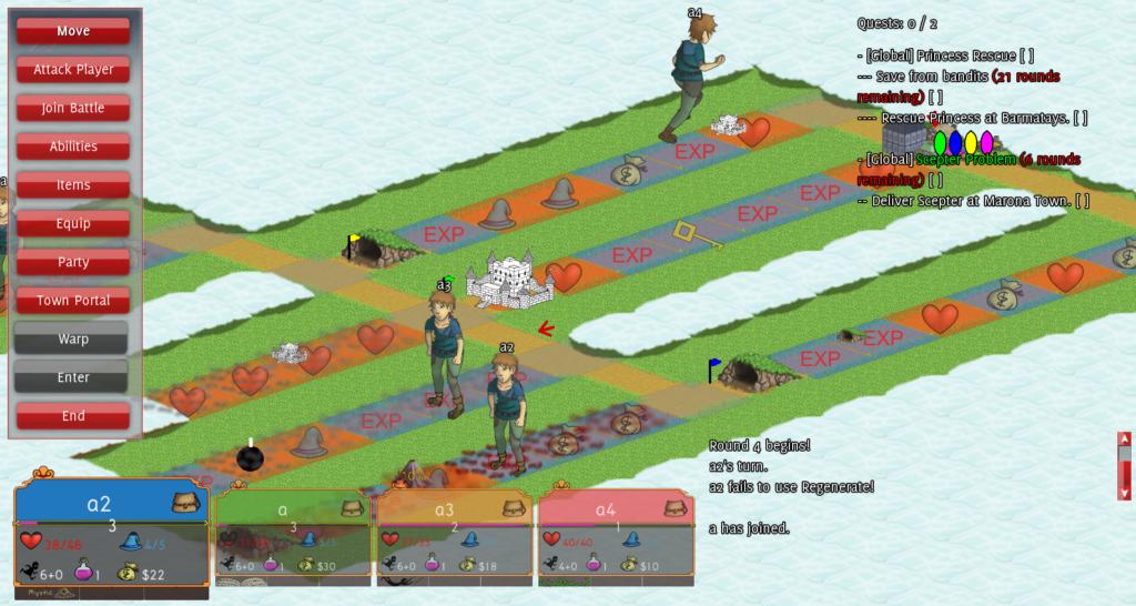
For context, the UI circa 2015 looked like the above. Most menus were similarly list based in hopes of making it easily translate between mouse and gamepad. It was a confusing, bloated mess that testers hated. Most prominent was that people constantly forgot what abilities they even had since they were buried in awkward sub-menus.
After a great deal of UI concept work in 2015 (some of which made it into the game, but still wasn’t good enough for testers) it became obvious to me that just shipping the entirety of UI work over to artists with basic specifications of what I wanted was actually a really stupid way to build a UI. Don’t get me wrong, game designer UI shouldn’t make it into the final product, but you should absolutely try to do your own rough drafts of UI before telling other people what to do. Why? Because if you don’t you end up being an idiot asking for the impossible. You need to understand the basic problem space created by your designs, and where to cut things back to accommodate reality. Once you get to that point you can let the artists take it the rest of the way, both functionally and aesthetically.
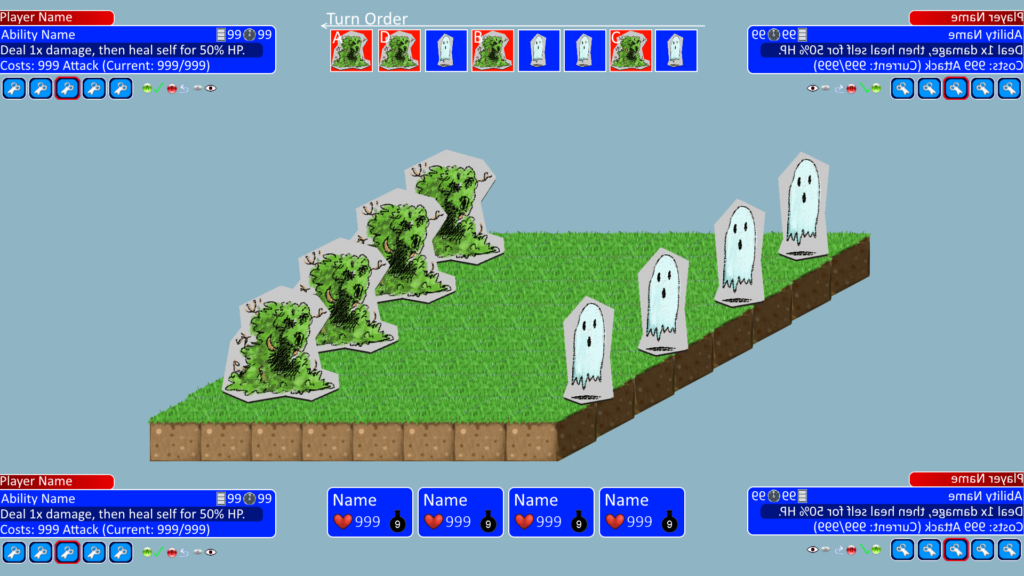
In general the theme of this year would be the year we finally started to accept the limitations of reality and started to cut things back. When I started the UI overhaul I was still committed to a few things: the game should be playable with a gamepad, and players should be able to play simultaneous multiplayer on the same computer/console. So the first design that made it to production (after many, many attempts) heavily reflected this in the form of the “4 corner” system:

The idea was to give each player their own dedicated menu in a corner, giving us a balanced symmetrical look. It had a variety of advantages: online you could always snoop on what other players were doing, it allowed simultaneous input even on the same device (giving testers the long-desired ability to do things when it isn’t their turn), and it was much better optimized for gamepads. But it had a major problem: the game really wasn’t designed for such small menus.

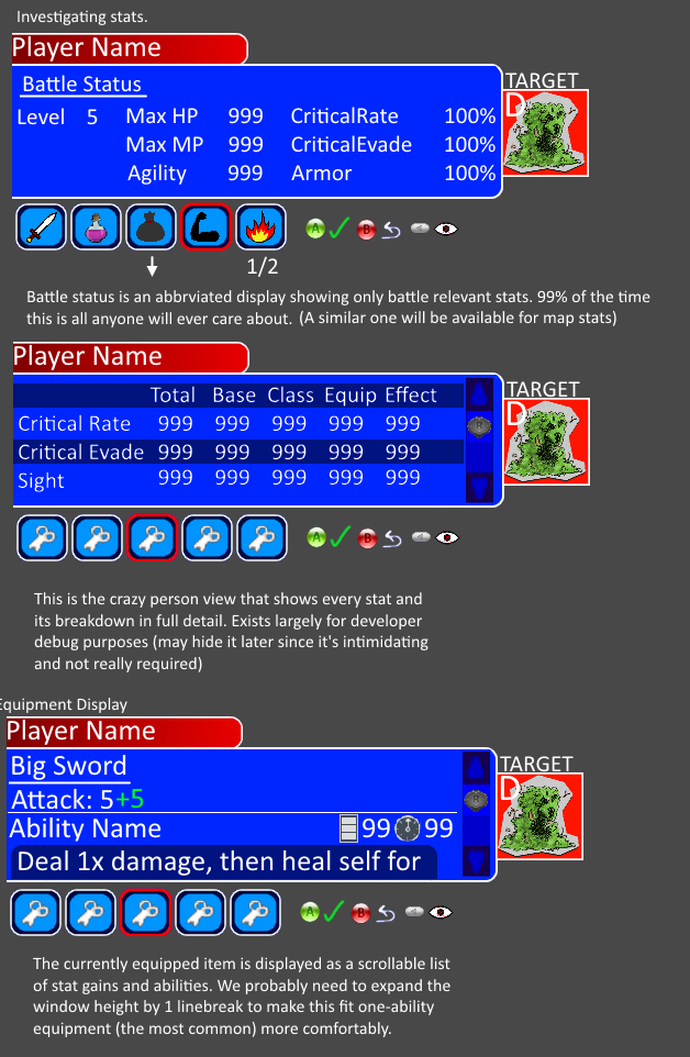
All the way through March I was stymied on how to make it work and just kept churning out attempts. On a positive note unrelated to the 4 corner design itself I had finally learned to cut down the character status information to only what players need at a given moment (just HP and potions in battle, gold when it’s your turn on the map, etc), I started presenting the turn order in a legible iconic format instead of the quick hack of numbered ordering we had been using for years, and I finally gave in and used icons instead of cheaper text menus for the sake of being able to compress things down visually. These are the elements that I had to get my own hands dirty in order to accept: if an artist told me to have fewer stats on screen my response was “that’s really annoying when RPGs hide stuff!”, but when having to play UI Tetris yourself the problem becomes undeniable.
