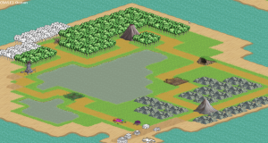
Somehow this week turned into even more extended testing. We’re at the point now where the testers have nearly run out of things to break. Was probably for the best, I have a firmer grasp on the current feel of the game.
The other big thing has been changing up how I store my notes/todos, largely because my current format ceased to be useful Let’s take a brief tour of the history of my planning practices:
Design Docs
The start of my using documentation for work was with game design docs. Something I started doing very early on, probably because I read about it somewhere. My design docs essentially act as overviews that describe what a game is, both to clarify it for myself and to easily get team members up to date on what a game is. I rarely get into specific details or numbers in these overviews, as those are better suited for separate, dedicated documents. I imagine if you had a larger team maintaining the overview on a constant basis would be necessary to keep everyone on the same page, but at my scale I tend to discard them once the game is fully functional.
Todos
At some point future ideas, responses to tester feedback, bugs to fix, and just generally detailing and ordering future work became too much for me to store in my head anymore, and I started writing simple text documents that consisted of long lists of things to do. Eventually one document became too small, and I started making multiple (generally for different subsets of a project).
Work Notes
From the todos evolved work notes. Essentially documents where I type the process I use to get something done. In many ways these things act the same as talking out a problem to another person: if you have to describe your current problem outside of your head you often find ways to solve it in the process of describing it. Another common component of these is listing all the solutions for a problem and comparatively deciding the best course of action.
There are many other benefits besides problem solving, though. It becomes extremely easy to get back to work after a break because it just requires re-reading where you left off in your thought process. If something fails later on and I need to find out why something is the way it is, my old notes often have the answer (admittedly this shouldn’t be necessary most of the time, but it’s a good back up). It’s a habit I picked up specifically for this project, and it’s incredibly helpful.
Wiki / Trello
For awhile we tried to maintain a living design doc in the form of a wiki. It really didn’t work out. It generated a lot of maintenance overhead (any time you changed something, you needed to restate it in the wiki). It also didn’t serve much purpose when there’s just the two of us. I probably underestimate how useful some of that maintenance work can be in the long run, though.
Later on we adopted Trello as a shared todo list to keep us up to date on what the other was doing. In retrospect this is a dumb idea for two people who can just as easily tell each other what they’re doing. Nonetheless, I converted my old todo entries into the task format. There were some real benefits to being able to assign hefty work notes to each task, and seeing percents creep up while working was pretty neat. That said, it’s honestly not made for the bulk of tasks I have since you can only really see 5 or so tasks in a list clearly with it. I have over 80 tasks registered to it right now, so casually browsing the list became impossible. Older tasks just ended up sinking further and further into the background since the nature of the list encouraged keeping the most recent items more visible. It resulted in me creating a lot of duplicate tasks later on, ignoring my old notes on each subject.
What I needed was something with similar organizational capacity for notes, but with a better large overview so that I could see all of the tasks by casually skimming. I basically decided something with a tree view would be appropriate.
Wikid
There aren’t actually a ton of note taking programs with tree views out there. I eventually settled on wikid which is basically a personal wiki that displays the links in the wiki in tree format. Not quite as easy to manipulate the tree as I’d like, but it has benefits like being able to link related tasks together and the ability to tag tasks (ie, based on priority) and then view the list that way.
I’m still in the process of converting all my old notes to this new format, but so far it seems immediately apparent that this is a much better way to organize this stuff. Since it’s basically just a text editor, I can effectively store my work notes using it as well which will make back referencing them easier later on.
This whole process serves a second purpose which is that my main goal here is to decide what still needs to go in the game, and what doesn’t need to go in the game anymore. I also need to come up with any unplanned additions that need to happen. It’s a long process, but this is the best time to sort all this stuff out before making the final push.
