Archive for the ‘GameMake’ Category

Surprise!

While my cohorts won’t admit it (at least not to my face (but probably more as a tool to keep me moving)), the way the base animation looked needed some love. Both structure-wise and painting-wise. Since I was faced with the task of basically redoing my Spine project, I figured now was the perfect time to kill some birds.


The first step was to adjust my default standing position. The old one was just the first frame of the only animation that existed at the time, but it’s kind of a bitch to work with. A much better idea would be to draw the character standing a little more normally. So let’s do that real quick!

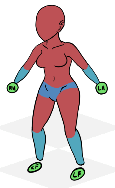


Balls for hands and feet – The #1 sign of a lazy artist


What’s this?! Surprise, women! And surprise, all pieces completely redrawn and proportioned better! Ho-Ho. They are also drawn a lot larger than the old version. Yeah, I know, even my old version was way bigger than we’re putting them in game. I think Hawk said he was resizing the old one by around 80%. Yikes. So why would I take the time and trouble to make full version even larger? It’s just easier to work with, get off my back old man. Here’s the back view, ’cause I’m generous.
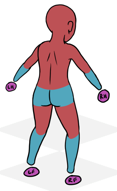


Butts & Ammo


Okay, so now what? After some quick alignment tests in Spine to make sure I drew all the pieces the right sizes to prevent overlapping, it’s time to do some paintin’. Oh boy, my favorite. Oh, and actually drawing the hands and feet. Lazy, lazy.
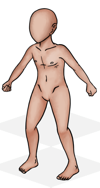
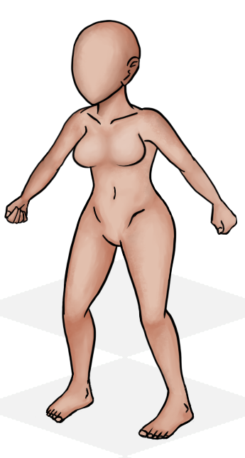


Some of the lines on the male chest have been erased and edited ’cause I forgot too before saving this. Also, the female torso is a different size than the male so doesn’t line up perfectly right here. Pretend it does! (’cause it does)


Now everything looks good again! Excite! From here, I do a heavy amount of work in Spine. I convert several of the body pieces into meshes to help remove gaps in the animation. I’ve also gone ahead and properly set up the skins in spine, so switching from male to female during any of the animations is as easy as clickin’ a button. After all the meshes are made, it’s time to recreate all the animations again. This is probably the easiest and hardest part of this process.
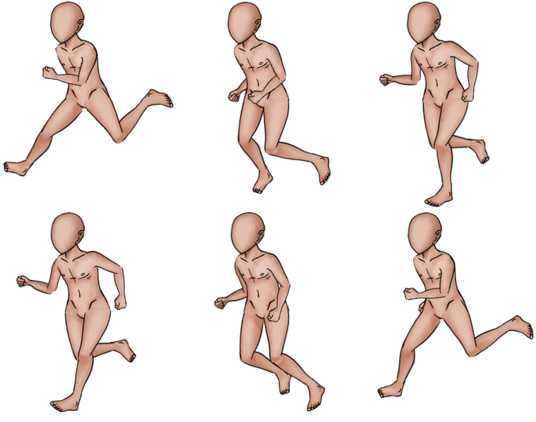
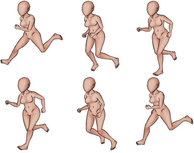


boing. This are 50% of sketch size


Keep in mind these are nowhere near finished animations. I did this animations super fast just to kind of get a feel that I was on the right track and that my meshes were working properly. The left upper arm still need some tweaking, just a little too bulky at the top and I can’t mesh that away.


I have a few things left to do here that I was hoping I’d have enough time to finish before this blog went up, but I guess I don’t. I still have to paint the North set and mesh it, then do the the animations proper again. None of these are the daunting task that I thought redrawing everything was though, so I’m very pleased with the speed and quality I managed to do this at.
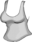


I did in less than a week what took me more than a year to do the first time. I’ll just let that sink in.
 

Knab, Og

I’ve put aside UI work for a bit until Hawk is fully ready prepared to work on it with me. It seemed like better choice to work on it at the same time than to prepare a bunch of stuff and then have to go back and edit it all. It’s also hard to work on certain parts of the UI when we aren’t completely sure what going to be getting cut or heavily altered. Instead I jumped back into Spine, where I belong.


So I had forgotten to properly skin my animations in Spine. I thought I did, but I totally set it up wrong. I went back through and tried to adjust my existing animations with skins properly, but spin kept crashing on me because it hates meshes being added to a skin slot. Or.. hates them being added after the fact. I haven’t been able to pinpoint the bug exactly, but submitted what I do know about it either way. Using the skin feature also requires me to slightly re-evaluate the clutter in spine in regards to attachments. I have it down in theory and have made some example projects. Bone->Attachment->SkinPlaceHolder->[name.png], which is pretty much the structure on how it is now. I can’t use skins for the clothes though since I can only view one skin at a time. I’m thinking of going with Male/Female skins, but yet at the same time, it might be more worth it to do male/female as separate projects. In that, I could have all of a certain outfit as a skin. That approach loses me the ability to ‘easily’ see mixing and matching of clothing pieces though. The way it is now, I have to turn on the individual pieces myself to view an outfit.. decisions.


Other than messing with that, I haven’t really done a whole lot this week. Been fairly stressed about some things and just. Wanting to take the rest of the weekend easy so I don’t blow another gasket.


Playing Catch-Up

I can’t believe I didn’t blog last week. I seriously thought I had. Well, this is what last weeks blog would have looked like in a single image:


class2


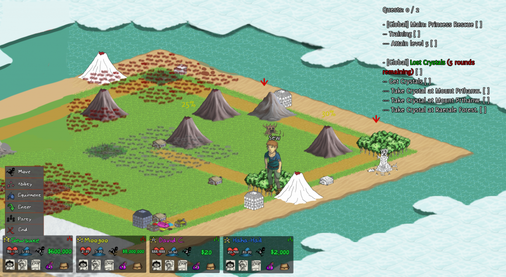
This week I continued to try to expand on this idea, to get the UI as locked in as I can. I arrived at roughly this point before shifting focus.


fuller-UI-mockup3


We began discussing the idea of the quest log and quest markers. Ideally, the quest menu would either be a sub-menu or non-existent. Hawk suggested revising the quest arrows, to make them more informative of what is going on. So an arrow will point to a location that has a quest, that arrow will inform you who that quest is for (global or party), what type of quest it is (battle, event, payment?), if you meet the requirements for that quest, and if it’s part of the Main quest line or not. In addition to that, I was also thinking it would be best of town names were constantly displayed, either over the town or under it. This is putting me in a weird map-clutter position, that if I don’t handle it perfectly the map will be a nightmarish visual mess.


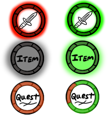
So here is my first pass with some generic icons, some of which I resorted to using text in! Gross.


So instead of indicating global or party, we’ll just indicate ‘Party!’ with the party icon. If the party icon isn’t there, it’s global! It’s also great to reuse the same party icon from the menu instead of trying to find a second way to display the same information. Easy enough! The main quest is a fancy gold that has a pretty shine animation so you can’t miss it. I want to add some kind of color indicator for quest types as well, but need to mull that over a bit more.


I’m also torn on how to show “You meet the requirements to complete this quest”.


Thinking about glows of green and dark red/black to indicate ‘can’ and ‘can’t complete respectively. Or coloring the ring around it green or red (green ring not pictured!). At the bottom I’m using my ring design as a “percentage complete” indicator for quests that require multiple things and you are part way there. So if it required 2 things and you had one, half of the notched would be filled green while the other half would remain dark or red, some different color. Just.. throwing that idea out there.


The final big discussion was about quests that aren’t viewable on your current screen. How do we tell the player there is a quest they are involved with, but just out of the way? First thought was a bad one, of just having edge arrows. We have too much other stuff around the edge to do that. So now I’m leaning more towards arrows in a radius around the player pointing to where the quest is. The arrows will need to be basic, possibly giving no information other than “quest over there”, and maybe as much as “a quest you can complete this way, a quest you can’t complete that way”. They’ll require a slightly different kind of arrows than the ones mocked up here, though. (There is also the unspoken option of not display quest arrows for quests off screen. Though, I might get yelled at for that one)


Art Blog? What’s That?

Been kind of all over the place this week design wise. I’ve been a little disillusioned with the project itself, too. Some days I think the game is great and fun, and some days I just wonder ‘how do we make sense of this mess‘. I think that’s probably a normal feeling for a long project like this one.


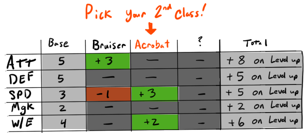
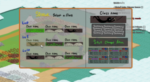
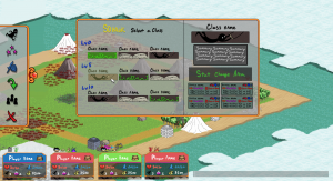
However, the last few times we’ve gone to test I just didn’t want to. It felt like a chore, something I didn’t really want to do. I haven’t been really having fun playing the game. Part of it is because I don’t understand easily what is going on with a lot of it. I’m picking a class on my first turn, most of which I don’t really understand what they do. This could be partly a reading comprehension issue, except even the few classes that I understand, I don’t understand them from the class info I get when I have a chance to pick it. We have to improve this information so it feels less like homework or a guessing game to figure out who you want to be. The problem is only amplified when you get to pick your second and third classes once you hit the appropriate levels. It’s difficult to wrap my head around how interesting and useful a Mystic Bruiser Acrobat is going to be, when I can’t fully understand the benefits and drawbacks of each of them. [Classes that alter the stats you get on level up should probably show you a ‘total after you take this class’ to prevent further confusion when picking 2nd and 3rd classes? (Like if one class raises your HP but the other one lowers it by the same amount per level, you can know that easily?)]


This is pretty hefty and maybe not practical, but it’s the kind of information I think people need to know?


I’ve also lately been having a problem of really not knowing where to go or what to do. I know how the game functions, I know I should be completely quests but. I feel like I keep making poor choices (not including death chests >.>) that put me almost infinitely behind. If someone else starts out strong, my only hope is that they meet some great misfortune or I get incredibly lucky. Usually when something bad happens to someone else though, it never seems /that/ bad. Having said that, I haven’t got to finish a full game in awhile, not since the respawn timer was added, and that might help that completely.


I’ve been caught in the ‘pretty boring but important’ part of this for awhile now. Interface design might feel more rewarding when it’s actually in game and I know what’s going on, but all the parts that will make the game charming don’t exist yet, and that’s on me. I haven’t been able to get to enemies, their animations, story backdrops, more backgrounds, eventually making the map not look like a train wreck. You know, the.. artsy stuff. The things that will make everything seem more lively and engaging. When I look at this I think, “Oh, yeah, we totally got this. This is exciting!“. And I’m sure I’ll feel a ton better once we’re back around to doing that. Regardless of my current feelings, be that from my mood or something just being off, I haven’t forgotten that I love this game and I remember what it can and will be once we get it done.


UI8

ui8


Font still my temporary awful handwriting. Menu icons not set in stone, I actually.. still kind of dislike the move icon. I am fairly pleased with the party icon/indicator though. My biggest worry is that Inventory will probably need to be added to the menu itself, as having just the bag in the corner is super unintuitive.