Playing Catch-Up
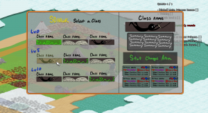
I can’t believe I didn’t blog last week. I seriously thought I had. Well, this is what last weeks blog would have looked like in a single image:

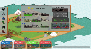
This week I continued to try to expand on this idea, to get the UI as locked in as I can. I arrived at roughly this point before shifting focus.

We began discussing the idea of the quest log and quest markers. Ideally, the quest menu would either be a sub-menu or non-existent. Hawk suggested revising the quest arrows, to make them more informative of what is going on. So an arrow will point to a location that has a quest, that arrow will inform you who that quest is for (global or party), what type of quest it is (battle, event, payment?), if you meet the requirements for that quest, and if it’s part of the Main quest line or not. In addition to that, I was also thinking it would be best of town names were constantly displayed, either over the town or under it. This is putting me in a weird map-clutter position, that if I don’t handle it perfectly the map will be a nightmarish visual mess.
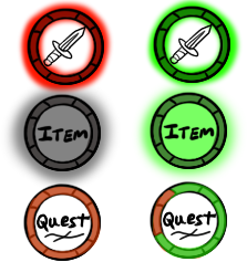
So here is my first pass with some generic icons, some of which I resorted to using text in! Gross.
So instead of indicating global or party, we’ll just indicate ‘Party!’ with the party icon. If the party icon isn’t there, it’s global! It’s also great to reuse the same party icon from the menu instead of trying to find a second way to display the same information. Easy enough! The main quest is a fancy gold that has a pretty shine animation so you can’t miss it. I want to add some kind of color indicator for quest types as well, but need to mull that over a bit more.
I’m also torn on how to show “You meet the requirements to complete this quest”.

Thinking about glows of green and dark red/black to indicate ‘can’ and ‘can’t complete respectively. Or coloring the ring around it green or red (green ring not pictured!). At the bottom I’m using my ring design as a “percentage complete” indicator for quests that require multiple things and you are part way there. So if it required 2 things and you had one, half of the notched would be filled green while the other half would remain dark or red, some different color. Just.. throwing that idea out there.
The final big discussion was about quests that aren’t viewable on your current screen. How do we tell the player there is a quest they are involved with, but just out of the way? First thought was a bad one, of just having edge arrows. We have too much other stuff around the edge to do that. So now I’m leaning more towards arrows in a radius around the player pointing to where the quest is. The arrows will need to be basic, possibly giving no information other than “quest over there”, and maybe as much as “a quest you can complete this way, a quest you can’t complete that way”. They’ll require a slightly different kind of arrows than the ones mocked up here, though. (There is also the unspoken option of not display quest arrows for quests off screen. Though, I might get yelled at for that one)