Of GUI and Men
A few things. I’m almost back in a full 100% of the time swing of game-workin’. Today was my last day of ‘dealing with other things’ for awhile. Sorry for being so inactive and having nothing super exciting to show for a bit!
Having said that, it might have been for the best. The game is starting to come together a lot better now, and I have a much stronger sense of what it is and what it needs to be. I’ve seen things in action and motion and I’m getting a much stronger feel for what is working visually and what isn’t.
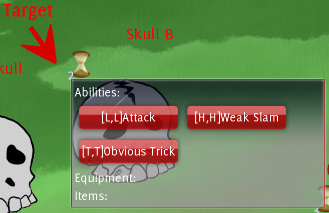
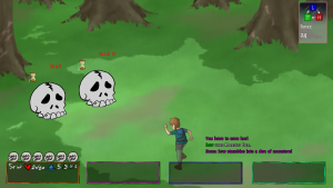
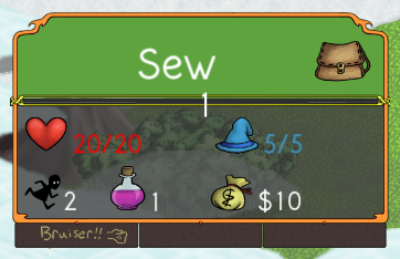
So the most recent thing we talked about visually was the battle gui. Currently it looks like this, with the player GUI and the monster targeting/attack dialogue respectively.


So this is.. kind of okay. The idea was to have the each player’s individual gui displayed on top of them (or at least near them). This is fine in theory, but it feels like work in a full fight of 4 players v 4 monsters. Your eyes are constantly darting. It is not my intention to pick on anyone else, but Hawk linked to an image of this kind of thing going overboard, and how it is kind of a slipper slope if we start adding on a bunch of status effects and timers and what not. Should this be a real concern of ours? I’m leaning towards yes, as instant readability is what I want most across this entire project. So how do we fix this?
We could approach it in a similar fashion to how we do our map GUI, which is to display players information along the bottom and top of the screen. We’d want it more compact because we don’t need to display as much information. There are a few differences. For one, on the map your character sheet is always on the leftmost side. You wouldn’t want this to be the case in a fight, you’d want it to be displayed in the order in which the heroes are lined up. (You could keep your own card always leftmost still, but you’d want to rearranged the heroes in fight to correlate to that and it just seems like a weird hassle, especially when trying to talk to another player about a fight, though I may be over-thinking this).

I left a big gap on the bottom that doesn’t really need to be there. My thought was to put attacks and abilities there but there are too many and we’d just run out of room. Ideally I could just compress this shape down further into something more manageable. However, I’m wondering if it is necessary to re-do the enemy GUI. It’s possible that leaving the hearts and timer above them isn’t an issue, though.. I could again be mistaken. This requires more mock-ups and discussion!
I’d also like to talk about the map GUI since we’re here..

I have issues with the current map character sheets as well, but it’s entirely a readability issue. (My kingdom for a way to skew and adjust things in real time). I think a lot of it might be the lack of a stroke around the text, and a few things displaying too small at a full resolution. There is no attention drawn to it in a positive way. It needs to not be loud and over-stress the screen, but it does need to quickly call attention to the important information, which it isn’t properly doing right now..